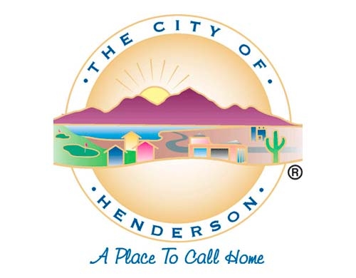
That could have something to do with someone once mistaking the logo on Snow's business card for a hamburger.
Snow said the logo is too detailed to reprint clearly on small items, such as business cards.
Snow also wants to do away with the saguaro cactus on the image. While the plant may signify the desert, it isn't native to the Mojave.
"We would like to have a more modern look," he said. "We would also like to correct the saguaro cactus issue."
The current logo, the city's third, was adopted in November 1993. According to information provided by Henderson spokeswoman Karina Milani, city officials wanted a more contemporary logo at the time and hired a firm named Communications by Design to create it.
Snow, appointed in April, said he informed employees in August of his plans to update the logo.
The announcement was not without controversy.
The city manager received two anonymous complaints. He acknowledged the logo is a source of pride for some long-term employees, but about a dozen workers have told him they support a change.
The Review-Journal received an anonymous letter, also addressed to other Las Vegas news organizations, that challenged reporters to investigate Snow's plans to revise the city logo.
"At a time when the city manager is making reductions in all departments, it amazes me that he intends to make this one of his priorities," the letter says. "Who is getting the job? A friend? A relative? This is blatant misuse of public funds."
But Snow said in-house resources are being used to create the logo.
Snow said he shares the concern about wasteful spending and plans to add the new image "incrementally" to avoid additional costs.
He said the new logo first will be used on digital items and on items that need to be replaced, such as business cards, stationery and uniforms.
Henderson officials have no plans to alter the logo in the terrazzo floor outside the City Council chambers. The image is 10 feet in diameter.
Communications director Bud Cranor, whose division is handling the redesign effort, said the current logo has more than 14 colors, making it both difficult and expensive to replicate.
Cranor said the new logo probably will have fewer colors, but residents should not expect a wholesale change.
Cranor wants to make sure Henderson residents will continue to identify with the logo and its motto, "A place to call home."
"It will still look like the city of Henderson logo, but with a few tweaks," he said. Cranor hopes the new design will be ready by summer.
The city's first logo, more aptly described as a seal, coincided with the city's incorporation on June 8, 1953, and contained no artwork.
According to the information provided by Milani, it was used until September 1969, when a logo created by Rozzi Commercial Artists was adopted. The color image described Henderson as the "gateway to Lake Mead" and had a golfer in the forefront.
The current logo has a golf course but no golfer. It also features a rising sun.
Or could that be mustard?


No comments:
Post a Comment